(c) 2017 by Barton Paul Levenson
One question that always comes up in analyzing economic policy--or politics, or the sciences, or anything else we can analyze statistically--is how one variable affects another. A "variable" here means some quantity that can vary, the X in an equation. For example--is the federal deficit linked to inflation? Do nuclear power plants in a community affect the local cancer rate? Does the brightness of stars relate to their mass?
One way to check this visually, before doing any math, is to graph the two variables in question--plot them out on a chart, with one variable on one axis, or direction, and the other on the other axis, at a right angle to it. If the points seem to relate to one another in some simple way, like all falling on a straight line, it implies a connection between them.
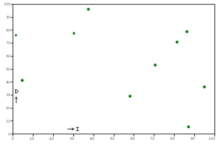
Here's an example. Suppose we plot the federal budget deficit on the Y axis, going up for higher values, and the inflation rate on the X axis, going to the right for higher values. Say we took the values for ten years in a row and plotted them, so we have ten points on our graph. And say the graph turned out to look like this:
I'm using arbitrary units on the axes. But the point is clear, I hope--there's no obvious relationship between deficits and inflation in this chart.
But now suppose the chart looked like this:
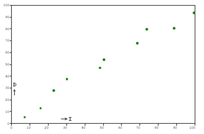
Here there does seem to be a relationship; the points lie very close to a straight line.
The cases aren't always this clear-cut. We need some objective criterion to describe how closely associated two variables are. The most powerful and widely-used statistic for this is the Pearson product-moment correlation coefficient.
Don't let the long technical term scare you off. We can just call it "r," "Pearson's r," or "the correlation coefficient." Here's the equation for it:
SSxy 3-1: r = ——————— (SSx SSy)1/2
The terms with SS are "reduced sums of squares." The definitions of each are:
Σx Σy
3-2: SSxy = Σxy - ———
N
(Σx)2
3-3: SSx = Σx2 - ———
N
(Σy)2
3-4: SSy = Σy2 - ———
N
If you do this by hand, you write the paired values (x and y) down as columns in a table. Then you add columns for the squares and the "interaction term" (x times y). When you have all your sums and squares you can just plug them into the above equations.
Here is such a table for the first chart above--our made up data, in fake units, for ten years of the federal budget deficit plotted against the inflation rate. I'll use X to represent the deficit (D in the chart) and Y for the inflation rate (I in the chart):
| X | Y | X2 | Y2 | XY |
|---|---|---|---|---|
| 71 | 53 | 5,041 | 2,809 | 3,763 |
| 58 | 29 | 3,364 | 841 | 1,682 |
| 30 | 78 | 900 | 6,084 | 2,340 |
| 1 | 76 | 1 | 5,776 | 76 |
| 81 | 71 | 6,561 | 5,041 | 5,751 |
| 5 | 41 | 25 | 1,681 | 205 |
| 86 | 79 | 7,396 | 6,241 | 6,794 |
| 37 | 96 | 1,369 | 9,216 | 3,552 |
| 87 | 6 | 7,569 | 36 | 522 |
| 95 | 36 | 9,025 | 1,296 | 3,420 |
| Σ: 551 | 565 | 41,251 | 39,021 | 28,105 |
With this data we can calculate the sums of squares using equations 3-2 through 3-4:
SSxy = -3,026.5 SSx = 10,890.9 SSy = 7,098.5
Plugging these into equation 3-1 gives us the correlation coefficient for the whole sample: r = -0.344.
r can vary between -1 and 1. A value close to -1 means high "negative correlation:" one value falls when the other rises. A value close to 1 means high "positive correlation:" both values rise and fall together. A value close to zero, like the one we just got, means no correlation, or a weak one.
Or at least, no linear correlation. Variables can be closely related by a non-linear function. For instance, x and y are tightly related in a perfect circle, but plotting one on a chart and taking the correlation coefficient would yield r = 0. We can ignore this, however. A non-linear relationship of this kind can be "linearized" and the actual relation found. For a circle, we would do it by converting the measurements to polar coordinates. But this isn't something we have to worry much about. Linear correlation is good enough for our purposes; we'll be able to see any non-linear relationships that pop up by charting them.
If we do a similar table for the second chart:
| X | Y | X2 | Y2 | XY |
|---|---|---|---|---|
| 7 | 5 | 49 | 25 | 35 |
| 16 | 13 | 256 | 169 | 208 |
| 23 | 28 | 539 | 784 | 644 |
| 30 | 38 | 900 | 1,444 | 1,140 |
| 48 | 47 | 2,304 | 2,209 | 2,256 |
| 51 | 54 | 2,601 | 2,916 | 2,754 |
| 69 | 68 | 4,761 | 4,624 | 4,692 |
| 74 | 80 | 5,476 | 6,400 | 5,920 |
| 89 | 81 | 7,921 | 6,561 | 7,209 |
| 100 | 94 | 10,000 | 8,836 | 9,400 |
| Σ: 507 | 508 | 34,807 | 34,168 | 34,258 |
This table gives us:
SSxy = 8,502.4 SSx = 9,102.1 SSy = 8,361.6
which in turn gives us r = 0.975. This is an almost perfect positive correlation.
We can say how much the variation in one variable accounts for variation in the other with yet another statistic: the coefficient of determination. This is just the square of the correlation coefficient. Taking the square lets us find this how-much-is-accounted-for figure whether the correlation is negative or positive.
For our first chart, the coefficient of determination would be r2 = 0.118: less than 12% of the variance of Y is accounted for by the variance of X. For the second chart, r2 = 0.951. Over 95% is accounted for with this high a correlation.
Now a word of caution. This always has to be said about correlation analysis, and it's very important:
All a high correlation tells us is that, for our sample of points, one variable seems to affect another. But we don't know, from this alone, whether X causes Y, Y causes X, some third factor causes both, or even whether the correlation is accidental and due to sampling error. Any of these four cases are possible.
"Correlation is not causation." Intro statistics courses pound this into your head over and over. Andean earthquakes correlate with oppositions of the planet Uranus, but the chance of any physical effect is near-zero. Jupiter and Saturn are closer and more massive than Uranus, but have no effect. And if you calculate the gravity of Uranus at the distance of Earth, it's barely there at all.
At 95% confidence, one out of every twenty relationships you find, on average, are just from random chance. Sampling error.
Correlation coefficients, and their associated coefficients of determination, are evidence. They can be used to check hypotheses or theories about variables. But they are not conclusive evidence. Never jump to conclusions.
For those who enjoy math, you can work out tables like I just did and calculate the figures you want. But you don't have to. Many computer programs have been written to do statistical analysis. If you like writing your own, I list source code as appendices to this tutorial. You can also do them automatically in spreadsheet programs like Microsoft Excel. I know not everyone enjoys math. Fortunately, in the computer age, you don't have to like math to use it.
| Page created: | 04/10/2017 |
| Last modified: | 04/13/2017 |
| Author: | BPL |