Vangel Vesovski is a Libertarian poster on the amazon.com boards who insists that anthropogenic global warming (AGW) theory is "a hoax." One of his favorite talking points, which he repeats again and again, is that NASA GISS temperature measurements are unreliable, as are any measurements but those of the satellites, and that the satellite data shows a cooling trend since 1998. In fact, of the two major satellite temperature series, RSS and UAH, VV denigrates the former in favor of the latter. The reason why is pretty obvious; UAH shows the lowest rising temperature trend. It's an outlier, but it's an outlier congenial to the denier position.
There are all kinds of things wrong with his talking point. I'll ignore the massive evidence for rising temperature, which is by no means confined to NASA GISS temperature station measurements. Let's assume UAH is the only legitimate temperature data and examine some of the problems which still remain with VV's thesis.
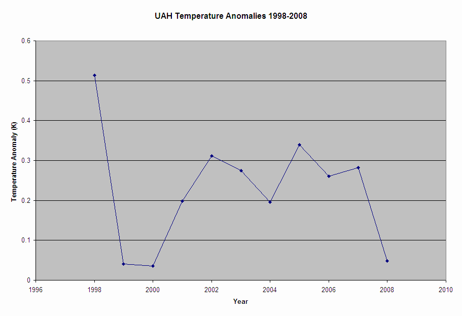
Let's get quantitative. Here are the UAH annual temperature anomalies for 1998-2008:
| Year | UAH Temperature Anomaly |
|---|---|
| 1998 | 0.514 |
| 1999 | 0.041 |
| 2000 | 0.035 |
| 2001 | 0.198 |
| 2002 | 0.312 |
| 2003 | 0.275 |
| 2004 | 0.196 |
| 2005 | 0.339 |
| 2006 | 0.261 |
| 2007 | 0.282 |
| 2008 | 0.048 |
Here's a chart of the data. Dramatic, isn't it?
|
If we regress anomaly on year, we get the following regression equation:
Anom = 9.733 - 0.000475 Year
The t-statistic on the Year term is -0.32, meaning the slope is statistically indistinguishable from zero and there is no way to tell if the actual trend is up or down. Again, see point 1. You need an adequate sample size, and VV hasn't got one.
Now, let's do the analysis over with an adequate sample size. The WMO recommends 30 years. Here are the UAH anomalies for the last 30 years:
| Year | UAH Temperature Anomaly |
|---|---|
| 1979 | -0.073 |
| 1980 | 0.088 |
| 1981 | 0.053 |
| 1982 | -0.153 |
| 1983 | 0.036 |
| 1984 | -0.258 |
| 1985 | -0.213 |
| 1986 | -0.147 |
| 1987 | 0.11 |
| 1988 | 0.109 |
| 1989 | -0.11 |
| 1990 | 0.074 |
| 1991 | 0.118 |
| 1992 | -0.191 |
| 1993 | -0.149 |
| 1994 | -0.014 |
| 1995 | 0.111 |
| 1996 | 0.022 |
| 1997 | 0.047 |
| 1998 | 0.514 |
| 1999 | 0.041 |
| 2000 | 0.035 |
| 2001 | 0.198 |
| 2002 | 0.312 |
| 2003 | 0.275 |
| 2004 | 0.196 |
| 2005 | 0.339 |
| 2006 | 0.261 |
| 2007 | 0.282 |
| 2008 | 0.048 |
And here's the chart for this data. Notice how VV picked out just the right-hand portion, starting from the obvious outlier of 1998 (the largest El Nino on record), to get his "downward trend:"
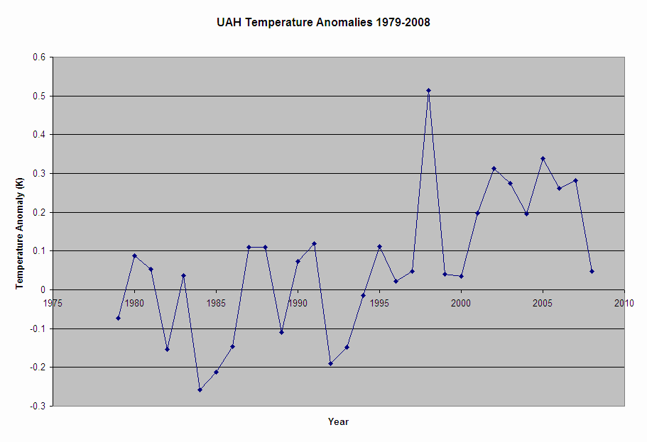 |
Now the regression equation is:
Anom = -25.265 + 0.0127 Year
And the t-statistic on the year term is 4.13, significant at well beyond the 99% confidence level. The temperature is rising, the increase is statistically significant. So says the UAH satellite record.
What does all this tell us?
For more on time series analysis, I highly recommend a book like Gujarati's "Basic Econometrics" (1978). But any introductory statistics textbook should have a section on regression analysis and significance testing.
| Page created: | 07/04/2009 |
| Last modified: | 02/14/2011 |
| Author: | BPL |